


Nossa Familia Coffee
Brand Identity & Packaging Design | 2014
Brand Objectives: Timeless and Competitive
Brand Core Words: Warmth and Family
Nossa Familia Coffee is a company in Portland, Oregon with a focus on exceptional relationships with their farmers, community, and customers. Starting the tradition with their founder’s family coffee farms in Brazil. They are committed to sustainability, ethical sourcing, and are a Certified B Corporation.
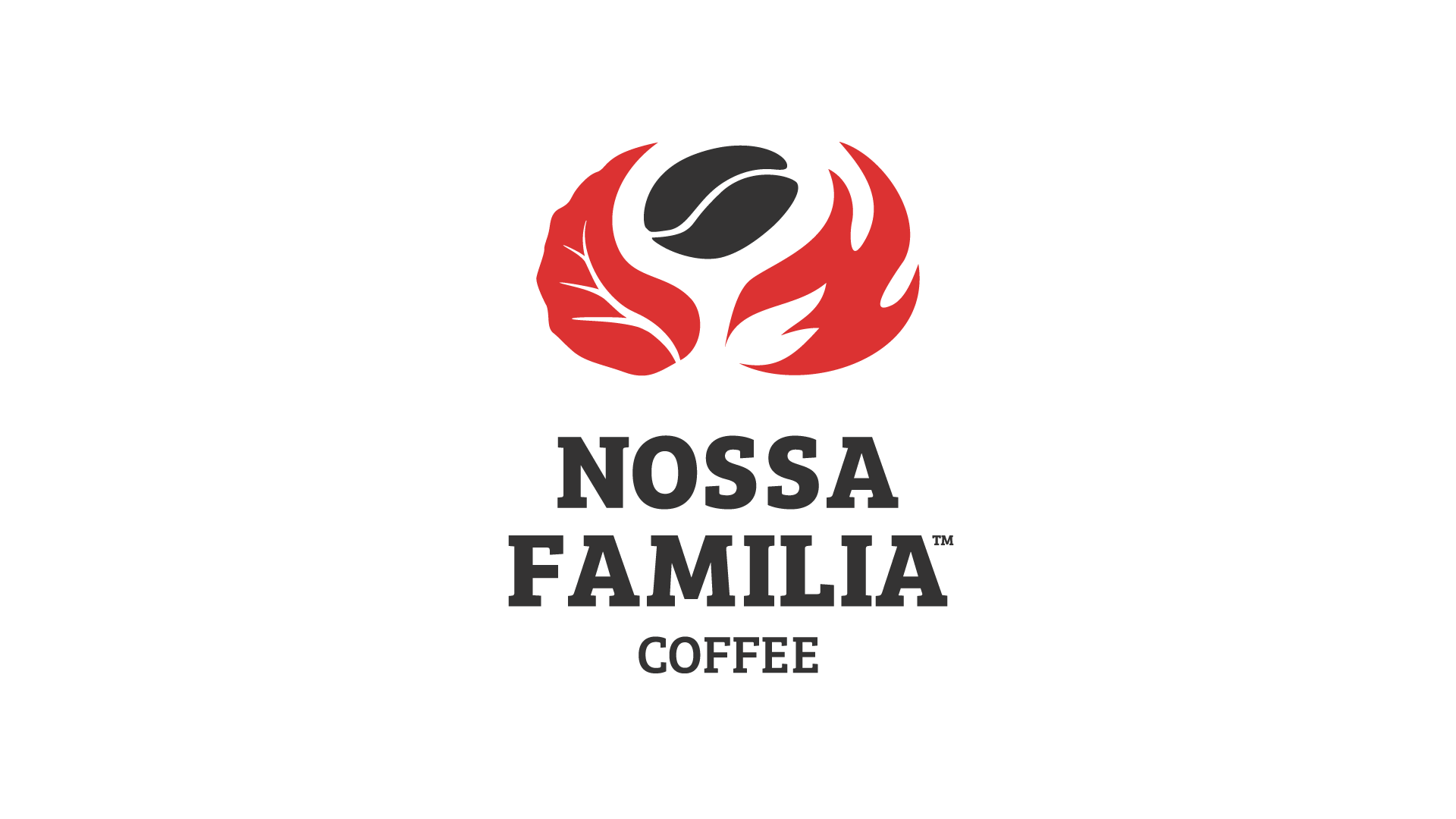
The logo has 3 parts: the leaf [representing the family farms], the flame [representing roasting], and the bean itself. Both the leaf and flame are shaped like hands supporting the bean. The logo communicates the love that goes into every bag.
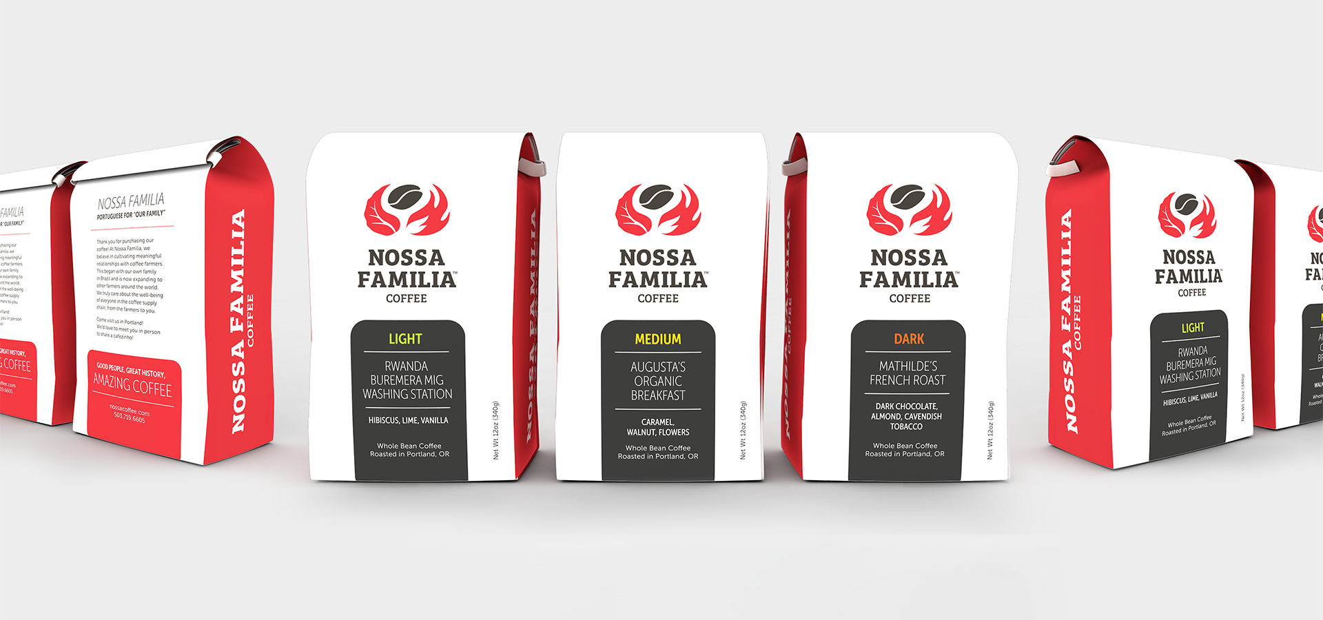
The Bag design by itself has a clean look with a bright white and red to make it highly visible on a store shelf. Only the logo is printed on the front to allow for flexibility in the type of coffee label applied. A rainbow color palette helps to quickly communicate the strength of the coffee, from red for dark roast to blue for decaf.


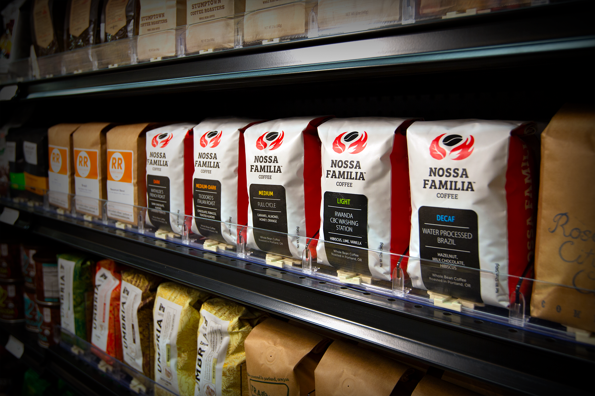
Nossa Familia Coffee saw
a 400% sales increase after
the new bag hit the shelves.
The project was a huge success and also won a 2014 Rosey Award.